Wax the Coping: Todd Bratrud's Craziest Graphics
WTC: Todd Bratrud's Craziest Graphics
Todd Bratrud penned his first deck graphic approximately twenty years ago and has been ruling it ever since. His unmistakable linework has graced decks (and t-shirts, stickers, patches, etc.) for companies such as Creature, Enjoi, Flip, Girl, Chocolate, Zero, Real and Heroin. Todd has never been known to shy away from edgy or taboo subject matter, so I hit him up to ask what, in his opinion, his craziest/grossest graphics are. I also asked him what his favorite graphic of all time is (one not created by himself). Take it away, Todd.

Heart Piss
This deck was part of a four-graphic series for a brand called True Love. The whole idea was to do a 180 on the brand's name. The series was meant to benefit the Keep A Breast Foundation, although from what I understand, True Love never delivered on that one, leaving me in a weird place having used my name and art for a breast-cancer-awareness campaign with no money being donated to the charity. I was happy about the whole series at the time and I think people dug the graphics while they were available, but after the deal went sour I didn't even like looking at the boards. The whole thing kinda left a bad taste in my mouth.

Wedding Present
This graphic was done as a wedding gift for Jon Humphries. Liam Cassidy supplied the art direction. I was working with him pretty closely at FLIP for a few years. I'm not exactly sure how this one was received—it's obviously a bit harsh. I believe there were only about 30 made (at the most), the majority of them on old-school shapes.
![]()
Logo Board
I did two or three graphics for Dave Carnie's Whalecock skateboards during its second run. This one was a re-creation of the existing Whalecock logo, just a little more cleaned up and with a way better looking cock—also a better-shaped board. I remember Dave being super happy about the penis image I found to use in the artwork.

Gator Belly
I don't think anyone liked this graphic. But since Roots was a small, local Minneapolis brand, they could only afford to run one graphic at a time, so ALL the local dudes were skating this one for a good while. I'm pretty sure I'd just taken my first trip out to SF around this time and got to visit the DLX art department. I got a good look at all the cool halftones they were using with their art at the time, and this was my attempt at mimicking that style. I obviously failed pretty hard.

Skull Fuck
This graphic started as a painting for a weird little dark-themed art show in Minneapolis. Naturally, it didn't sell, but it was seen by all the skater types in the Twin Cities area, and the boys at Roots asked if I wanted to do a rendition for a board graphic. The painting itself is now in the possession of Mark McKee. I traded it for the original art of his "Safety Gear" Blind graphic, which brings us to my favorite graphic of all times.

Safety Gear by Marc McKee, 1993
This board came out while i was in high school. I was already obsessing over board graphics and becoming more and more attracted to the designs that appeared to be made in the face of what popular graphics looked like at the time. I loved that there was a shift happening—suddenly things were cool because of how un-cool they actually were. And just the fact that this turned into an actual board graphic meant a lot to me—still does.
-
12/18/2023
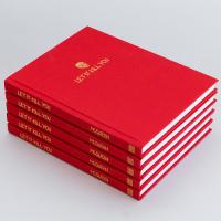
Wax the Coping: Ben McQueen’s “Let It Kill You” Series
 Ben McQueen is expanding his Let It Kill You book into a web series focusing on art and skateboarding. Sieben hit him up to get the scoop on the first three episodes, which feature Mike Gigliotti, Ryan Townley and Sieben himself.
 -
10/14/2022
Wax the Coping: Ben McQueen’s “Let It Kill You” Book
 Ben McQueen's book Let It Kill You explores the intersection of skateboarding and tattooing. Sieben hit up the author to get the skinny on the project.
 -
12/15/2020
Wax The Coping: Walker Ryan Wrote a Novel
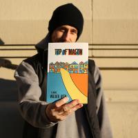 Wanna know all about Walker Ryan’s new book, Top of Mason? We did too, so Sieben hit him up to get the scoop. Read on, readers.
 -
10/18/2017
Wax the Coping: Foster Huntington Interview
 Seen Pool Scum yet? It's a stop-motion animation backyard-bowl-skating masterpiece! Sieben chats with Foster Huntington, the creator of the cartoon. Dude lives in a treehouse. He's got it figured out.
 -
6/02/2017
Wax The Coping: Don Pendleton Interview
 Sieben talks with Pendleton about the Alien Workshop days, John Grigley, winning a Grammy and how he really feels about Natas. Skate nerds, rejoice! This is your shit!